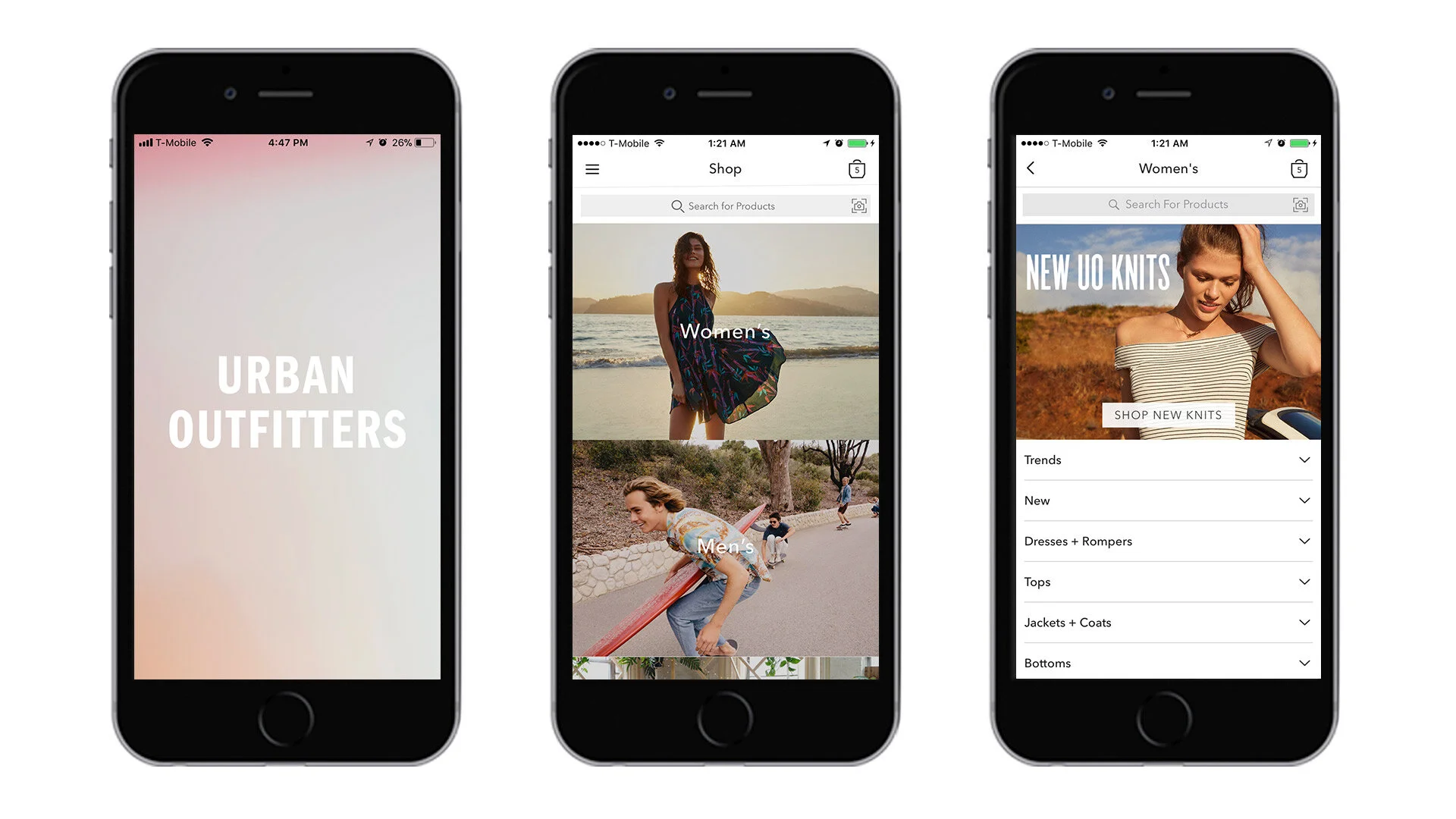
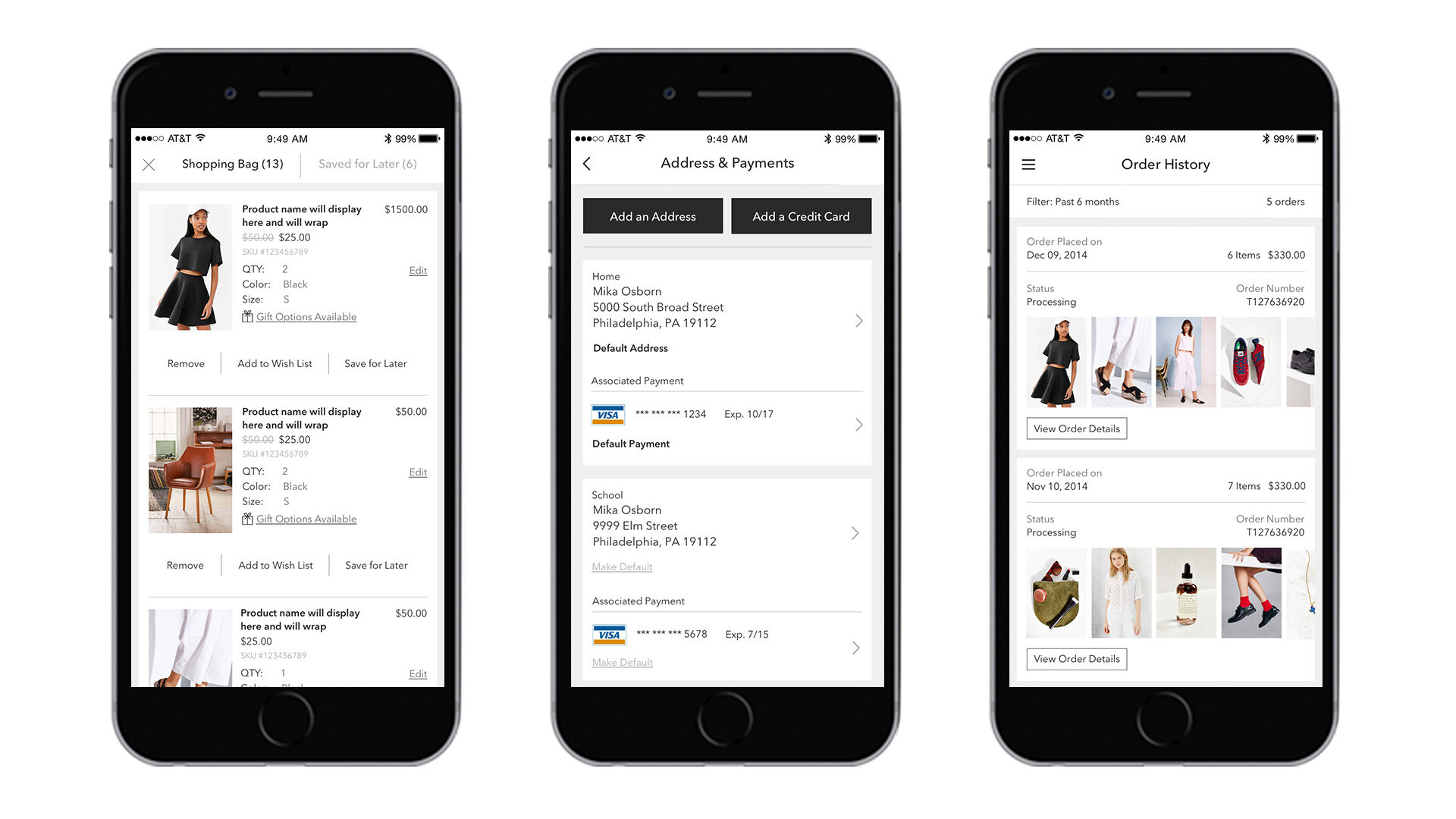
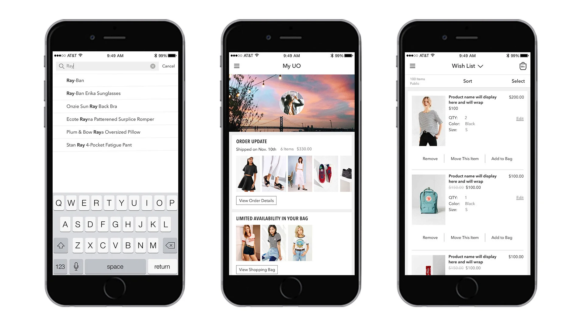
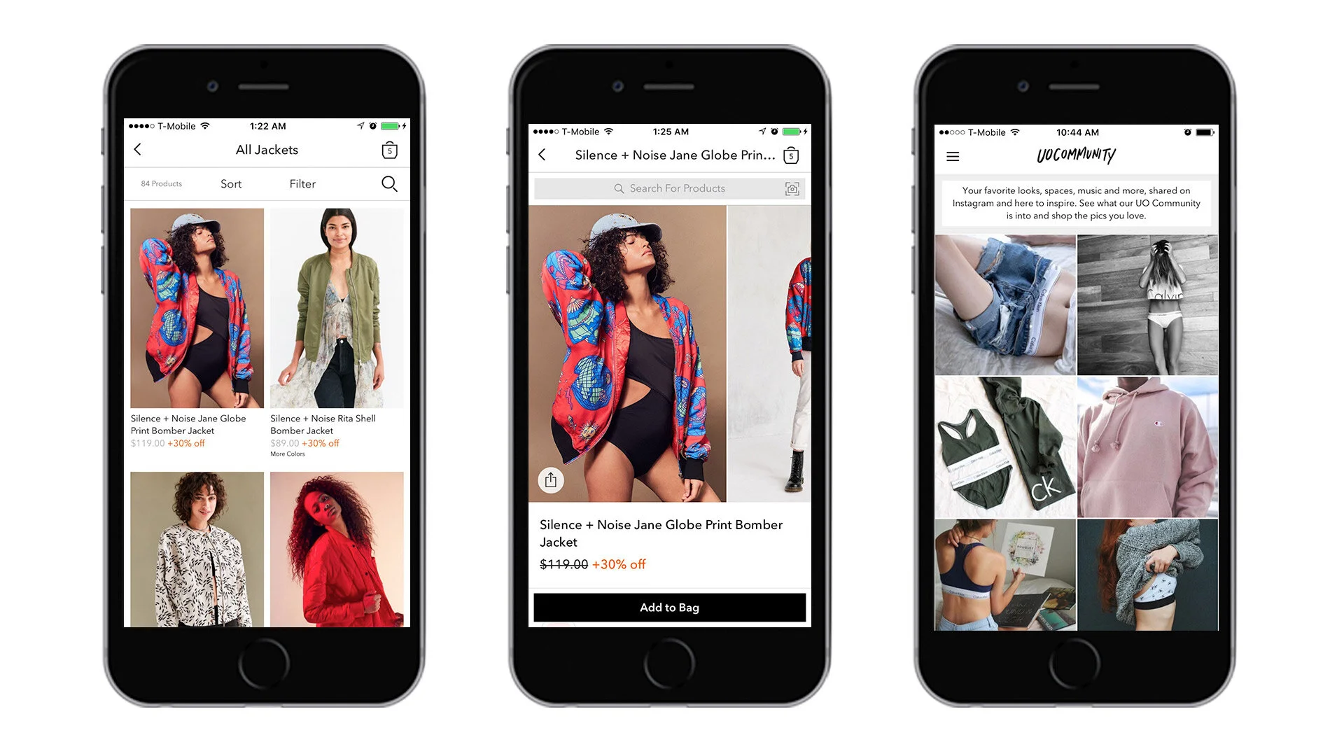
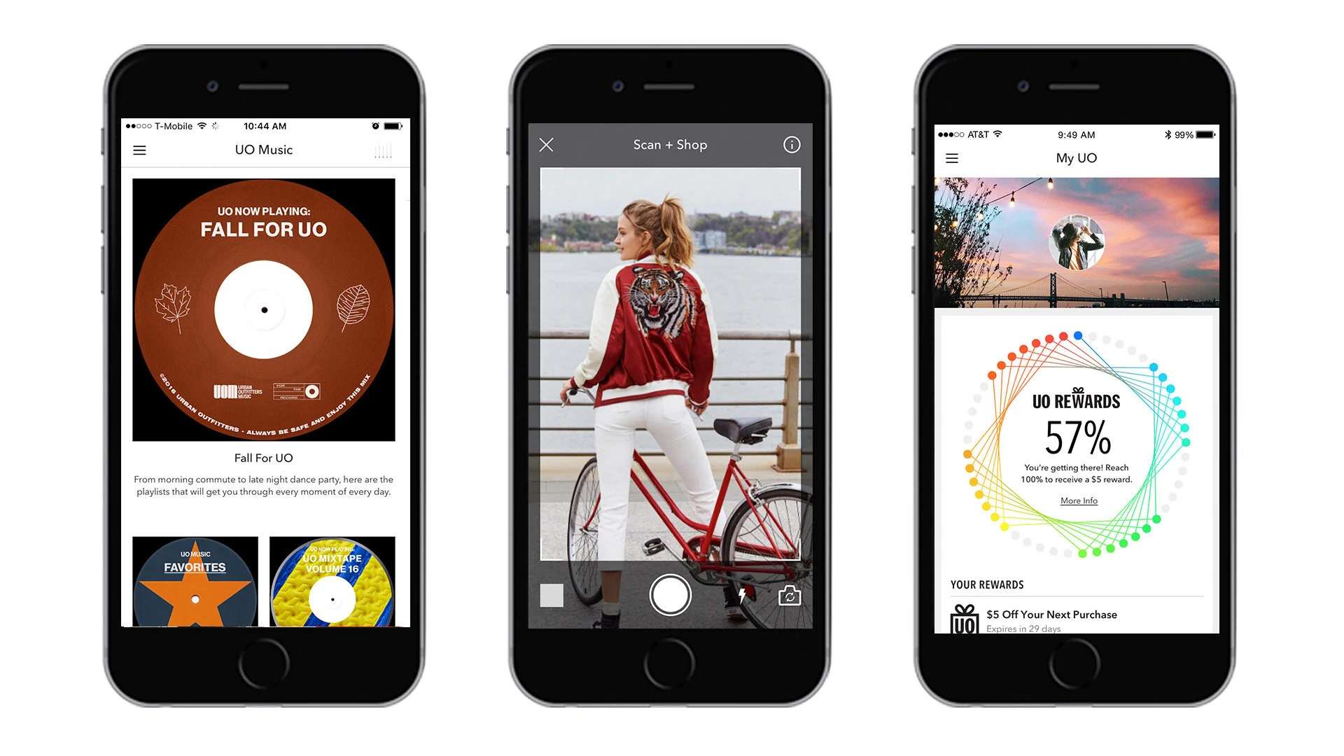
Here’s something I’ll admit: in a very early version of some internal deck, I described our still-in-development proprietary UO app as “a tiny Urban Outfitters store that lives inside your phone.” Reductive, right? But as silly as it sounds, it wasn’t totally off-base to think of it that way. Our goal was to translate the UO shopping experience—with all of its attendant brand equity—into a whole new environment, and to make the resulting user journey feel both familiar and exciting.
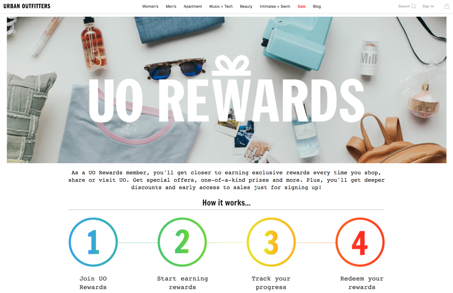
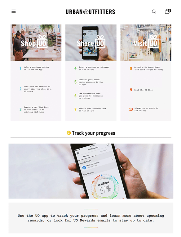
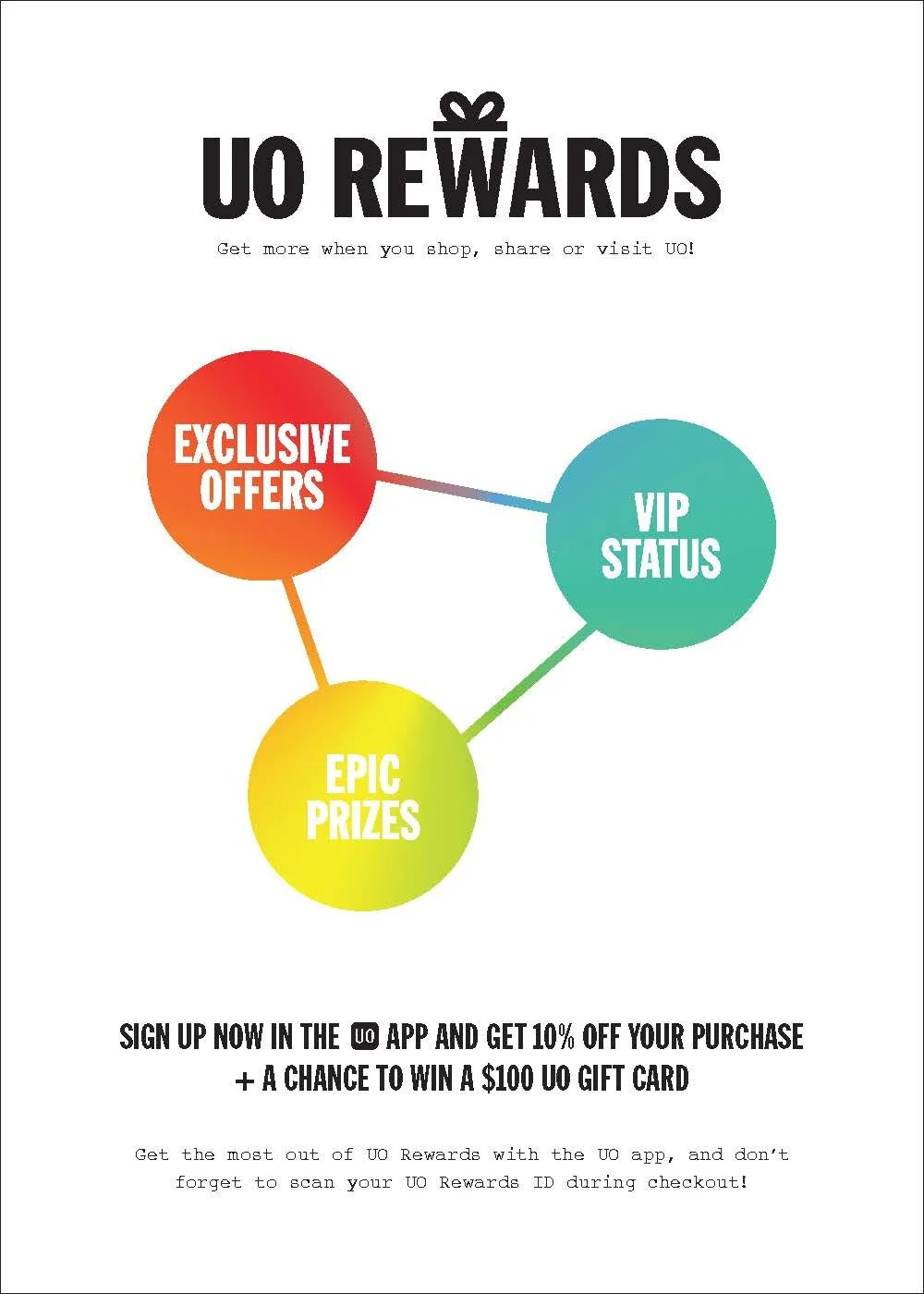
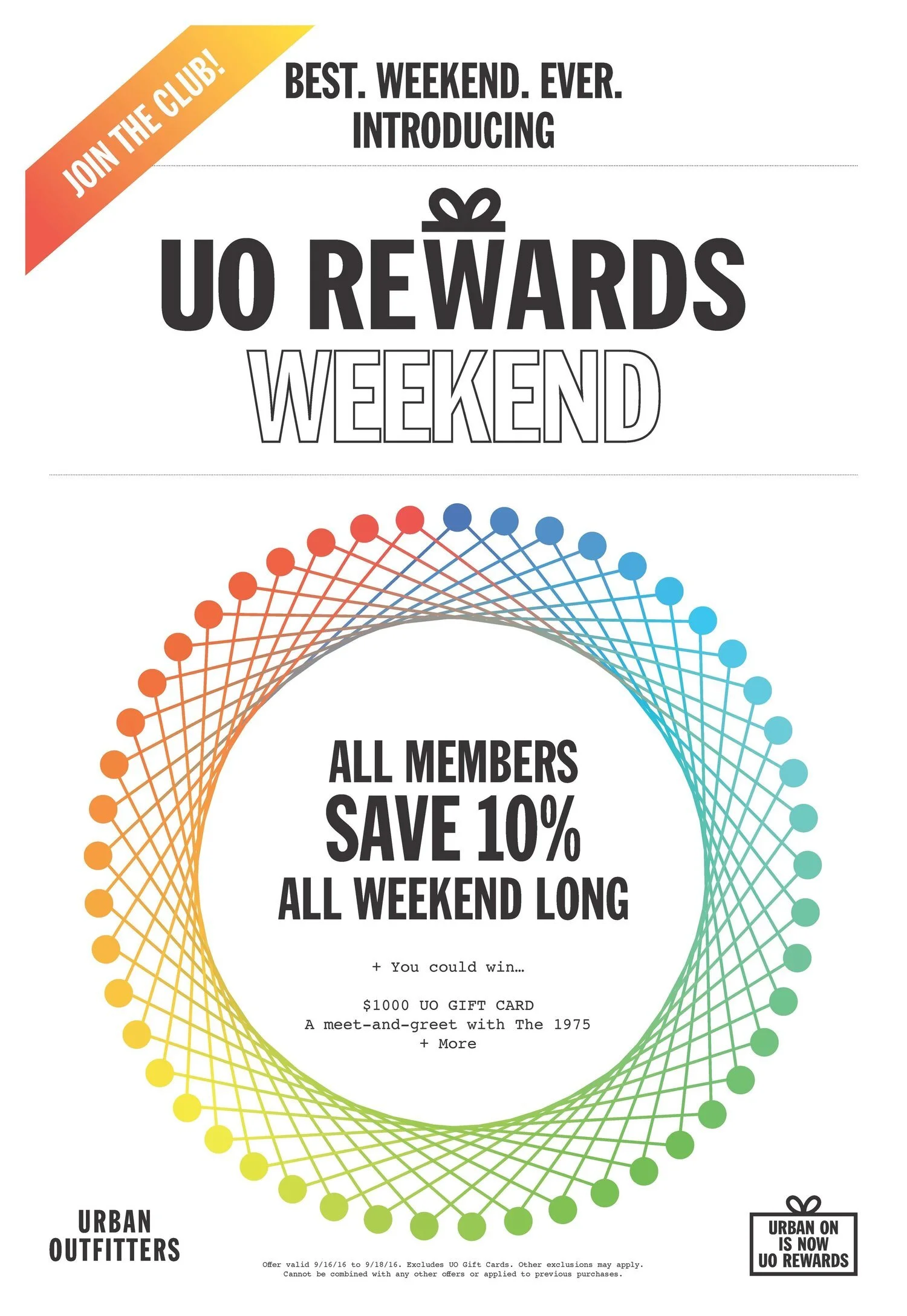
Almost simultaneously, we developed a 2.0 version of UO’s loyalty program, UO Rewards. Designed to show “progress” with an exceedingly cool (and deliberately ambiguous) spirograph display, UO Rewards was expressed as a custom app interface and microsite, and was rolled out with a full suite of multichannel marketing materials.